Turn raw analytics into clear UX decisions.
Prodlysis compares analytics reports across any period, pinpoints what improved or regressed, and hands teams building and analyzing product data actionable, AI-powered recommendations.
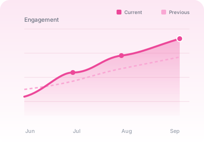
Everything a data team needs
From a single report to full before/after comparisons — all in one place.
Metric Dashboards
Clear visual summaries of every metric — sessions, drop-offs, rage clicks, scroll depth, and more — at a glance.
Compare Two Reports
Measure the impact of your changes. See exact percentage changes, improvements, regressions, and likely causes.
Data Explorer
Upload from any analytics platform (CSV / JSON) or paste metrics — Clarity, GA4, Mixpanel, PostHog, and more.
Export & Reports
Generate presentation-ready PDF or Markdown reports with an executive summary, metric table, findings, and next steps.
Report History
Save analyses and compare any two saved periods later. Your data is stored locally.
Private by default
Uploads are processed and discarded unless you save them. API keys live in a local config file.
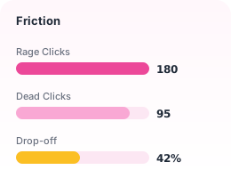
Friction at a glance
Rage clicks, dead clicks, drop-offs — tracked and compared.
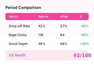
Before / After
Exact deltas per metric with health score.
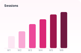
Trends over time
Spot patterns across weekly or monthly periods.
How it works
Three steps to a clearer product.
Upload
Paste metrics or upload a CSV/JSON export from any analytics platform.
Analyze
Prodlysis scores UX health, flags problems, and suggests fixes.
Compare
After changes, compare with a new report to verify what worked.
Your workspace
No analysis yet. Run your first one to see health scores and reports here.
Get Started →Recent Reports
View allYour saved reports will appear here.